Search in ideas for "RATIO CHART"

Greatest Gold vs Silver Ratio ChartRatios are great to spot if one asset is cheap or expensive versus another.
Here is Kagi on monthly chart demonstrating this!

Chainlink Is UndervaluedI tried to be as clear as I could with the takeaway message of this ratio chart.
When you get to the top of the channel (red bubble), it's typically a great time to sell LINK and buy BTC. When price gets to the bottom of the channel (green bubble), it's typically a great time to sell BTC and buy LINK.
Suffice to say, I am using some of my BTC profits to scale into COINBASE:LINKUSD . Chainlink is undervalued when compared to Bitcoin.
The featured content is intended to be used for informational purposes only. Everything shared here is my own opinion. It is very important to do your own analysis before making any investment based on your own personal circumstances. Please subscribe to our channel if you like what you are seeing!

ETH/BTC A PERFECT ALTSEASON MONITOR, "THE END OF ALTSEASON"ETH/BTC(MARKETCAP RATIO) ACTS AS AN PERFECT INDIACTOR IN THE MOVEMENT OF MONEY FROM KING BITCOIN TO ETH AND OTHER ALTS.
BY ANALYSING THE RATIO CHART, I THINK THE ALT SEASON IS ENDED AND WE ENTER THE BEARISH SEASON. PEOPLE TEND TO SHORT ALTS THAT OVER PUMPED IN PRICE IN MILLIONS OF DOLLORS AND THE THING IS HAPPENING.
---->YFIUSDT { Binance Futures #YFI - Unusual selling activity 7.07M USDT in 13 minutes (10%) }
----->Binance Futures #DGB - Unusual selling activity 749K USDT in 6 minutes (10%)
------> Binance Futures #XLM - Unusual selling activity 7.99M USDT in 2 minutes (10%)
------->Binance Futures #IOST - Unusual selling activity 2.57M USDT in 13 minutes (10%)
-------->Binance Futures #CELR - Unusual selling activity 1.4M USDT in 6 minutes (10%)
HOWEVER THESE SELLING PRESSURE HAVEN'T MADE THE MARKET TURN BEARISH,BITCOIN AND OTHER CRYPTOCOINS NOW HAVE VERY BIG INSTITUTIONAL SUPPORT LIKE SAYLOR,ELON,PAYPAL,GRAYSCALE,AND EVEN TIKTOKERS ARE IN THE RALLY OF MASS ADOPTION., THINGS WOULD HAVE MESSED UP AND THE MARKET WOULD HAVE BECOME A SLUM.
WHAT TO EXPECT NEXT? SAYLOR IS READY WITH HIS 450MILLION TO BUY AT 30K,GOOGLE PAY AND APPLE PAY OFFICIALLY ACCEPTED SWIPE CRYPTOCARDS IN ITS PAYMENT NETWORK. THE NEW INSTITUTIONAL SUPPORT HAS STARTED TO BUILD UP IN THE BOTTOM. WE SEE THE RISE OF BTC PRICE SLOWLY AND HAVE DROPS. NO TA WORKS, TWEETS CRASES THE MARKET.THIS SHIT WOULD CONTINUE UPTO 1-2MONTHS. BUT STILL WE ARE IN THE BULLISH ZONE ON THE YEARLY BASIS. ANY MASS ADOPTION OR BULLISH NEWS AFTER 3-4WEEKS CAN START A NEW RALLY ....
AS WE MADE A HIGHERHIGH ON 15JUNE(41K$) ""DON'T PANIC""

Market Neutral/Pairs Trade Idea: Long Clicks / Short Dis-ChemDCP has been one the best performers over the last few months. I initially recommended in July at R17.00, followed by 2 Trading View publications in December 2020 below 2150c (see attached). At current levels, the share trades ~ 3016c, with the 4H and daily RSI at 90 and 95 respectively. If you, like me, feel that DCP has run a bit too hard, you could pair consider a pairing a DCP short with a CLS long.
Here, the trader makes a profit in one of three ways.
1. CLS rising and DCP falling
2. CLS rising faster than DCP rising
3. CLS falling slower than DCP falling.
On the left, you'll note the ratio chart being extremely extended versus the 200-day moving average while nearly all the major short term time frames are 'oversold'.
Whether this is the exact low, I don't know however the short term reward-to-risk is starting is becoming attractive for a smaller-sized pairs trade.
Current Price (Ratio): 8.43
Entry Range: 8.37-8.44
Stop-loss: 8.24 ( a wider stop)
Target Range: 9.05-9.20

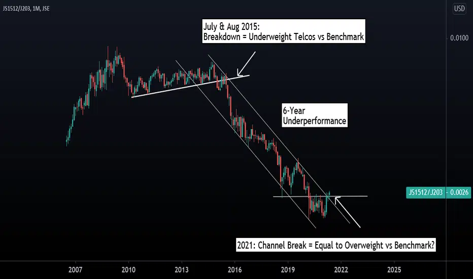
INTER-MARKET ANALYSIS: JSE Telecoms Index vs JSE All Share IndexLong Term Shift -Sitting Between Equal to Overweight vs All Share Index
On a relative basis, and from a sector allocation perspective, the relative ratio chart of the JSE Telecommunications Sector versus the JSE All Share Index suggests that long term investors are possibly shifting from an underweight to equal weight and overweight positions versus the benchmark. Technical evidence of this is provided by the break of the channel extending back to October 2014. We also note the break of the downward trend line extending back to the peak of November 2007 (a positive development).
WHY USE INTER-MARKET ANALYSIS? Inter-market is a powerful form of analysis, which is often utilized at an institutional level. The purpose being to ascertain which sectors, individual stocks, bonds or currencies may outperform or under-perform another. Essentially, it assists investors in understanding where to allocate capital and where to be over, under or equal weight, versus the market or versus an another sector.
LTC/BTC POTENTIAL PARABOLIC OUTCOME (DOGE/BTC COMPARISON)The LTC/BTC ratio has the potential to move in a similar crazy parabolic fashion as has been seen for DOGE/BTC.
Its non-serious nature and reputation as a meme within the crypto community together with a social network effect from the likes of popular figures in the tech sector have made Dogecoin a popular choice among new traders using brokers such as Robinhood.
Fundamentally, Dogecoin and Litecoin make use of the same Scrypt POW mining algorithm. Litecoin and Dogecoin can be merge mined and nearly 90% of Dogecoin’s total hash rate comes from large Litecoin mining pools, with its blockchain processing around 30,000 transactions per day.
If LTC/BTC follows the same path as DOGE/BTC then the ratio could reach extremely high numbers within the range of 0.05 - 0.2 LTC/BTC. This of course does not mean that this will happen but it is interesting to see the striking resemblance between the two ratio chart patterns.
Fundamentals:
Dogecoin and Litecoin are merge mined
Both use the Scrypt POW mining algorithm
LTC is traded on Robinhood the broker popular in the US with beginners and other Reddit netizens and BTC still has room to grow in the current macrocycle and the entire crypto market cap has room to grow during the altcoin bull run as new money flows into the market.
Technicals:
LTC has a similar chart pattern compared to DOGE and therefore has a chance to play out the DOGE fractal pattern
Monthly MACD histogram is about to flip green
Bullish Divergence on weekly MACD
Stochastic RSI on the monthly is oversold
Bollinger Bands on the monthly are about to expand indicating an increase in price volatility
Monthly EMAs on the weekly are poised to cross (20 weekly EMA about to cross 50 EMA)
Monthly PSAR has flipped bullish
TL;DR
Litecoin go up, much wow!

Gold vs US Equities Daily Point & Figure ratio chartOne chart to follow if you hesitate to choose between US equities and gold.
Current asymmetric reward vs risk profile in favor of gold is obvious...

DASH - DASHUSD - Update: Still good possibility to get onIf you missed yesterdays analysis on $DASHUST where we expected this uptrend, there's still time to get on GRADUALLY !

NVT going show a clear path herea break of triangle resistance and BTC flies, should remain triangle bound BTC dominance continues to Drop and we see the mother of all ALT seasons, either way strap in, watch this ratio chart and get in on the right side of things at the right time. Good luck everyone, I hope we all make it.

NIFTY - ONE QUESTION FOUR CLUESInteresting week ahead; concerns, hopes, frustrations, clues all mixed up. Come during trading time everyone gets clueless. Time to take a stock. Attached four graphs, Bank Nifty, IT, FMCG and Nifty. IT had dream run in between was underplayed finally makes a mark. FMCG failed head and shoulder and now makes new high and is on way further up (Did we not hear this time and again); Bank Nifty the bearish of all; after steep rise the fall has been sharp sans one week of gains since last two months. This one is crucial. The ratio chart of Bank Nifty and Nifty suggests basing in Bank Nifty (other words this will fall less in case nifty falls more; or this will rise more if nifty rises); More or less the Nifty Trendline Construction mimics IT and thus probability of it breaking higher is on. We have Chosen the 21 Day MA common for all. Once this is broken and closed comes around 14930 for the sake of safety. The door is open higher for longer. Bank Nifty bears close their shop above 33900 close. Stay to the Trend Lines; they done lie. Rest all is just a Risk and Reward Play.

Silver Junior Miners vs Silver's Monthly Ratio ChartWhale moment approaching...
If 70$ xagusd in Q3, then 81.2$ silj.

CNX IT Index - Knocking to break outIT Index / Nifty Ratio chart has been looking to knock to break out an important resistance. Breaking free will have more legs to IT Index.
DISC: Not a SEBI Registered. I post charts for my own study.

LongYesterday, the daily closing successfully broke through the 5-day EMA, and the daily cloud band showed bullish, and the 4H cloud band also showed bullish. At present, 4H RSI has broken the downward trend line. If the price can be callback, try to do more. The long target is to see the profit / loss ratio chart.

Gold vs Russel's Quarterly Ratio ChartLooks like we are at the "best buy" entry for gold vs US equities. Wayyy closer to a bottom than a top.

Nasdaq vs Gold Daily Ratio ChartSomething REALLY big right around the corner... and I mean days!
Gold & Silver explode higher OR we get a market crash first...
Oh Boy!
#gotgold #gotsilver #Nasdaq

Litecoin to Outperform BitcoinWhen looking at the Litecoin to Bitcoin ratio chart ( BINANCE:LTCBTC ), it suggests that Litecoin will outperform Bitcoin in the near-term. We see our breakout, retest, and now it's SCOTCH time. Let's take advantage of this!
The featured content is intended to be used for informational purposes only. Everything shared here is my own opinion. It is very important to do your own analysis before making any investment based on your own personal circumstances. Please subscribe to our channel if you like what you are seeing!

20 year bonds vs silver weekly ratio chartCurrently refueling tank. Next important move right around the corner!

Silver Senior Miners vs SPX's Quarterly Ratio ChartThis could be the quarter silver senior miners put in a bottom vs spx.
Creating a higher low.
Possibly defining an important arc which has a road map for silver to out perform US equities.

Ethereum: Inversed Head and ShoulderHello Investors and Traders,
Ethereum, along with bitcoin and litecoin, is showing an inversed head and shoulder. Ethereum is taking the lead by already breaking the neckline. Ethusd is currently very bullish ever on the ETH/BTC ratio chart. This pattern is pretty straightforward to trade.
Let me know what you think.

PSLV vs SLV Volume ratio chartThis chart shows the recent trend of increasing interest in the silver ETF PSLV (managed by Sprott Inc) vs. SLV (managed by Blackrock with JPMorgan as the custodian).
Volume ratio is normalized by ounces per share, so it is the ratio of silver traded for each ETF
PSLV is the preferred fund for the Reddit group wallstreetsilver and most people in #silversqueeze
fintwit/reddit has recently exploded with a lot of mistrust of JPM/SLV
Chart is a good indicator of the strength of the #silversqueeze and /r/wallstreetsilver movement

How Big is the Tech Bubble?A ratio chart divides the value of the Nasdaq 100 by the value of (S&P 500+Dow 30+Russell 2000). The large spike in the blue line to the left illustrates how the NQ became so overvalued in relation to the S&P, the Dow, and the Russell.
If the ratio pulls back, I would say it may find its balance around the lower red line, after retracing the recent parabolic spike like it did in 2000.
I think it will keep going higher. I think the high prices of tech stocks are more legitimate this time around.
I believe I just made a "this time is different" type of comment lol.
Thoughts?

SPX/TLT just broke out.Here is a SPX/TLT ratio chart with a SPX overlay(bottom panel) The the ratio has just broken out to new highs. This should be good news for stocks. The ratio with SPX overlay shows us that as long as the ratio stays positive so do stocks.
